Dialog Object Table
Dialog Object Table
A table is a list element in which similarly to the Listbox, data is shown tabularly, only a table can contain more than one column. The individual fields in a column are called "cells". Direct entries into a cell are possible if the column has the editable property.
The content of the table is determined by column. An indexed parameter specified at every table column. Filling commences from the stated start index to the first parameter value in the UNDEF state (an empty cell is created for EMPTY).
A table is marked by clicking anywhere in its area. Additionally, this click determines the active table column. The whole table is moved by left clicking and dragging just like with other dialog objects. Therefore moving a table column is not possible using the Drag & Drop or marking several columns.
The editable property allows you to choose if the contents of the table are editable or not. If a table is editable, stating the target parameter is optional.
The column width of the individual columns is set in the dialog editor but it can be changed by the user as well as by the decision table (f$SetNumProp) during runtime. The width of a column is set by positioning the cursor over the column boundary in the table header. The mouse cursor will then change into a double arrow. The width can now be changed by dragging while left clicking. If the overall width of all columns is wider than the table width, scroll bars are automatically blended in.
The format set in the parameter table at the column parameter is used to display numbers. If a special format is needed or if the desired format is not uniform, the number parameters can be copied into a text parameter before the dialog is called via the decision table.
In addition to the general properties, a table has the following properties:
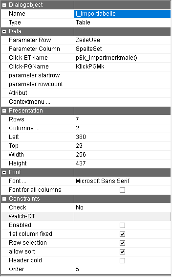
Parameter Row | Parameter name of the parameter which contains the current selection in the table. The target parameter data type determines the kind of return: with integer data types, the running number of the marked row is returned (even if "only select rows" is not activated), with a character string the content of the marked cell is returned. Decimal parameters should not be used. Please note: - The "only selected rows" setting should not be selected together with a target parameter of the character string type because the marked sell will not be recognizable otherwise. |
Parameter Column | Name of a parameter on which the current column is written. Even if the parameter is a character string type, the column number is always written onto the parameter, not the content of the cell. Attention: Numbering of the columns starts with 0. |
Click-DTName | Name of the decision table which is called at every click in a cell. Additionally to the content of the parameters for rows and columns, the content of the following parameter groups can be evaluated. |
Click-PGName | Name of a parameter group of the TDV:TABLECLICK type. The information of the current clicks is written onto this parameter group in order react to it in the deposited decision table. The following parameters are written: Button: Which mouse button was clicked (1-Left, 2 Right) Shift: Was the Shift or Control key pressed? 0-No, 1-Shift key, 2-Control-key,4-alt key All of the following statements about rows and columns start with 0. With rows, the number 0 is always the Caption. Row: Number of the current row When several cells are marked: In case the table has the "only select whole rows" property, the possibility exists to mark individual rows or entire blocks of rows at the same time when selecting rows by using the Shift or Control key. (If a table column contains images, this possibility does not exist!) In that case the following information is written into the parameter group: NumberRows: Number of selected rows |
Number of data rows | A parameter can be entered here which determines the number of table rows to be displayed. When this parameter is filled, that number of rows is displayed, regardless of the allocation of the parameters of the individual columns. |
Attribut | When using the dialog in ePOS, a decision table can be specified as an attribute which is called by double clicking on an unchangeable cell. Tip: A double click DT behaves like a Watch-DT or action DT. |
Rows | Number of rows which are to be displayed in the development system in order to optimize the width of the individual columns even in combination with a scroll bar. The number of rows in the runtime system does not depend on this. |
Columns… | The current number of columns is displayed in this field. A ... button appears when this cell is clicked on. The column editor is opened with this. |
Font … | By default, this sets the font for all columns. However, in the column editor you can also change the font for each columns. Thus the columns can have different fonts. If this is the case, when the font is reset, the change will only occur for the columns for which the font was not manually changed in the column editor. Note: If necessary call up the dialog again so that the changed fonts become visible. |
Font for all columns | Enabling this option will set the font for all columns regardless of whether there are manually changed fonts in the column editor or not . |
Check | By activating the check, changes in the selected rows or the selected cell can be reacted to directly during the execution of the dialog. The following choices are available:
|
Enabled | Controls whether or not the table content can be changed by the user. |
1. Column fixed | By activating this option the first column always remains visible, even when the table is scrolled horizontally. |
Row selection | The setting causes the entire row to be marked automatically when clicking on a cell during runtime. Please note: - the target parameter of the table should be an integer data type in this case and thereby contain the selected row. |
Allow sort | When this property is set, the user can sort the table into the heading row by clicking. The whole parameter group which serves as a table source, not just the displayed columns are sorted. For this reason, the function is only admissible if parameters from the same parameter group are used in all columns of the table. If a heading row in an already sorted column is clicked on, the sorting will take place in a descending way. The same can be achieved if the Shift key is held while clicking. If the alt key is pressed while clicking, the column is used as a further sorting criteria. The sorted columns are identified by the ˆ or v symbol at the end of the label. |
Header bold | Identification, whether the column heading is in bold, even if a standard font type is used otherwise. |
Column editor:
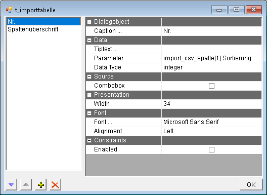
The list of columns is on the left hand side. Columns can be inserted, deleted and moved using the buttons in the lower area. The properties of the columns clicked on, can be changed in the right hand area. The following properties are available:
Parameter | Defining the parameter with the data for the active columns. |
Caption | This is the Caption of the active column in the column header. Using the button with the 3 dots, the text of every column to be displayed can be recorded for every language of the dialog. |
Data type | The data type of the column. If a data type is specified logically, the column is displayed as a switch. For the data type icon, assigned images can be ICO, .BMP or .JPG. The name of the image has to be on the column parameter. The other data types are currently not being evaluated. |
Editable | Controls whether or not this column is editable. Only applies if the table element is editable itself. |
Combo box | Should a Combobox be used in the column? for example: red|green|blue. When using this method, a different content of the Combobox can be assigned for every row or column. |
Orientation | By default, all texts are displayed left-justified and all numbers right-justified. This setting only has to be explicitly set to left-justified and right-justified if the data type of the column parameter does not correspond with the desired display. |
Font type | Determining the font type (Font,Color, Size,...) for the cells and the headers (joint determination). Note: If necessary call up the dialog again so that the changed fonts become visible. |
Tiptext … | Multilingual assignment of a tip text (tooltip). This tip text is displayed only in PROMETHEUS. This option is only visible if the "Export dialog to PROMETHEUS" option in the "Local settings" in the "Dialog" tab in the "PROMETHEUS" group is active. |
The table has to be assigned a target parameter for the selection (for unchangeable tables) as well as a parameter field for the values to be displayed for every column. Otherwise an error message appears when trying to save the dialog.