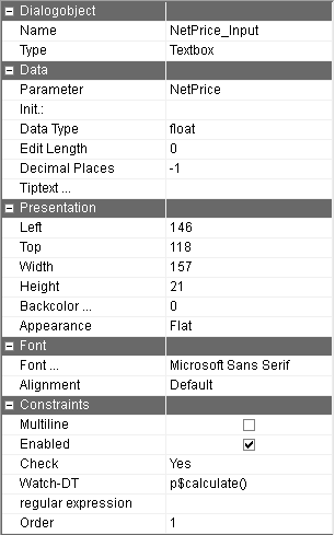
Dialog Object Textbox
Dialog Object Textbox
The dialog object Textbox allows input values to be queried as well as simply to be displayed (Property "editable" deactivated). This is easily recognizable by the background color of the field (white=editable; grey = just display).
An output of "calculated Labels" is also possible in order to present an offer number in the heading for example: "Offer 4711: Calculation". The "editable" property needs to be deactivated for this and in the "appearance" property, "no frames" needs to be selected. The Textbox will then optically resemble a Label.
The value formatting generally takes place via the format set in the parameter table for the parameter which is permitted to contain the respective unit just like in Microsoft Access. In order to use this format, the input length and decimal place properties (see below) have to have the previously set default settings. Changing these settings should only be done in special cases.
Init | Presentation of a default value in the dialog. This value is only used in the development system in order to more easily determine the width of the Textbox. |
Parameter | The name of the parameter assigned to the field. Via this parameter the values in the fields are swapped with the logic. If this parameter has a value when executing, then this value is displayed in the field - otherwise the value from initialization is displayed. The parameter name can be selected in the input assistant and can be moved into this field using drag&drop. The data type is then automatically accepted. |
Tiptext | Multilingual assignment of a Tiptext. |
Data type | ata type of the parameter. This field is automatically accepted when using the input assistant to choose the parameter. If "Date" is selected as data type, a date selection field is automatically used with which the date can be selected. |
Check | By turning on the check, value changes can be directly reacted to when exiting the field while running the dialog. This can be used for error messages as well as to set suggested values for other dialog fields. Alternatively, the check can be activated when |
Edit length | Number of places which are permitted for input. In general, this setting should remain at the default value 0 which indicates an unlimited input. This applies especially to number inputs. Alphanumerical database fields are an exception as they are limited in |
Decimal places | Number of the decimal points for parameters of the decimal data type to be displayed. The default setting (-1) is the system standard (6 figures) if no format was displayed in the parameter table (see above under "formatting"). The separator set by the |
Enabled | Whether or not values can be entered into the field during runtime can be determined here. This is a default setting which can be changed for the runtime with the function f$SetBoolProp. |
Multi line | After activating this property, the Textbox can also be changed in height. If a text is longer than 1 row during runtime, it is wrapped word for word. |
Alignment | Standard: Character string are positioned on the left, Numbers are positioned on the right Left-justified: The values are presented in a left-justified fashion Right-justified: The values are presented in a right-justified fashion |
Appearance | Flat: The appearance is in a simple flat frame 3D Appearance: The appearance is in a deepened 3D frame |
Regular expression | The content of the textbox will be checked against this regular expression. If it does not match, the initial string is used instead of the text. |
Background color | Textboxes which are editable and are not a date selection field can receive a background color. |
The Textbox has to be assigned a parameter. Otherwise an error message appears when trying to save the dialog